In this third installment on application analytics patterns and practices I’m going to focus on how Runtime Intelligence can be used to shed light on Ad activity within the context of one or more applications. While the use cases covered here are nowhere near exhaustive, I’m going to show how to answer the following questions (and hopefully give some indication as to why you may care about the answers):
- What are ad impression volumes across multiple apps?
- What are the click-through rates (the ratio of users clicking on ads to the volume of impressions) across various pivots?
- What influence does culture (country of origin) have on click-through rates, e.g. are Germans more or less likely to click on ads versus Italians?
- What carriers/ISP providers are giving me the most business, e.g. where are my users most likely to be found?
- Where are users spending most of their time inside an app? Does that usage pattern correlate with a user’s likelihood of clicking on an ad?
- Do returning users interact with ads differently than first time users or power users?
Many of these metrics are valuable in scenarios other than ad effectiveness of course (knowing where users spend their time and understanding how power users behave are two obvious examples), but for this installment, I am going to focus exclusively on how Ad interaction can be viewed across these metrics.
Implementation
I'm using the same trusty one line method WhatPoseWhen that I described in the first installment – this time, I call the method on the New Ad event (to count impressions) and the Ad Engaged event (to count clicks on ads). I could just as easily collect data on any other ad-related event and grab any data that is available to the program at that point in its execution as well. Here is the code for that method in its entirety:
private void WhatPoseWhen (string page, string selection)
{ return; }
The first parameter tells me from which page the method is being called and the second parameter tells me why I might care, e.g. was a new ad displayed, etc.)
I pass the page name and the ad event into WhatPoseWhen and Runtime Intelligence grabs these parameters and sends them up to the repository (no programming for this). I can then correlate the ad activity within the context of sessions, feature usage, and runtime stack data that I am getting as a part of runtime intelligence.
For these metrics, I export my CSV data into a regular excel spreadsheet and then generate the pivot tables shown below.
App background
I always like to use data from true production apps rather than fabricate data sets; I am using two apps that I wrote and launched on the marketplace that are both ad driven, Yoga-pedia and A Free WPC Yogi – the former is a free version of a yoga app that (hopefully) helps to drive sales of a for an upgrade to A Pose for That. A Free WPC Yogi plays a similar role for The WPC Yogi, a tailored version of A Pose for That targeting WPC 2011 attendees.
I always like to use data from true production apps rather than fabricate data sets; I am using two apps that I wrote and launched on the marketplace that are both ad driven, Yoga-pedia and A Free WPC Yogi – the former is a free version of a yoga app that (hopefully) helps to drive sales of a for an upgrade to A Pose for That. A Free WPC Yogi plays a similar role for The WPC Yogi, a tailored version of A Pose for That targeting WPC 2011 attendees.
The following post uses their Ad activity over the same one week period.
Impression counts
The following pie chart shows the “new ad” event count by application. As you can see, Yoga-pedia has roughly 4X the number of ad impressions and given the fact that these apps are very similar (but not identical) in their behavior, this also roughly correlates to the volume of usage as well.
The following pie chart shows the “new ad” event count by application. As you can see, Yoga-pedia has roughly 4X the number of ad impressions and given the fact that these apps are very similar (but not identical) in their behavior, this also roughly correlates to the volume of usage as well.

Click-through rates
However, when I divide the total number of “ad engaged” events by the total number of “new ads,” I see that A Free WPC Yogi has a 28% higher click-through rate (1.78% versus 1.37). In point of fact the demographics of the app users are quite different (randomized consumers versus MSFT partners who are attending WPC 2011).
Advantage: This intelligence helps to segment users by differences in their behavior and to do a better job of targeting those differences across apps.

Impressions by country (or culture)
Runtime Intelligence can grab the IP address of the sending tower – this is not personally identifiable and cannot be used to locate an individual with any precision – but it is more than adequate to identify country, state, and city. In the following graph, I simply count new ad events by country and show the top 10 countries by impression volume.
Advantage: If your app has a cultural bias that would benefit from localization, understanding where your users are can help prioritize those localization efforts.

Click-through rates by country (or culture)
The following bar chart calculates the click-through rates for the top 10 countries listed above. What is interesting here is that there appears to be a significant difference in click through rates by country (culture).
Advantage: Understanding when/if users from specific cultures are significantly more likely to respond to (click on) ads can further help to prioritize localization or marketing investments.

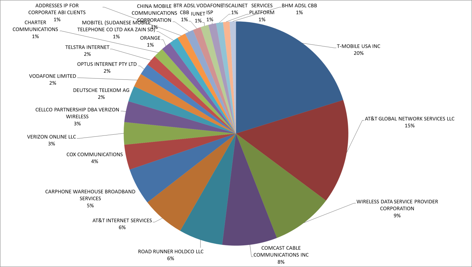
Impressions by ISP provider (top 25)
To produce the next graph, I used an application to tell me who owned the IP addresses that my mobile clients are using (I used IP2Location – but there are many of them out there).
This is a nice way to see who my users favor in terms of their carrier. Here I only show the top 25.
Advantage: Understanding carrier popularity will help focus business development/marketing efforts and better manage potential risks associated with how your users may be negatively impacted by upgrade schedules (delays). Will your next app be dependent upon Mango?
Sessions per app page
In the raw CSV files that can be exported from the Runtime Intelligence portal, there is a column, ApplicationGroupId. The value in this column is unique for all signals (messages) that are sent from within a single app session. In other words, I can use this field to organize all user activity into the relative user sessions using this field. This is helpful for plotting specific user patterns.
The following graph simply counts the unique occurrences of ApplicationGroupId values by page name value (recall that this is the first parameter of the WhatPoseWhen method). This avoids counting multiple views of a single page within a single session and tells me how popular specific pages are across my user base. For this posting and for illustration, I’m only showing data for five specific pages.

FindAPoseDetail and BrowseSelectPose are central to the user experience (browsing for yoga poses and then drilling into a specific pose for detailed imagery and instruction). TellMeMore is the page where I describe what comes with the paid version of the app (nice to see that 10% of my users deliberately choose to investigate the upgrade possibility) and AppGuide and TopicList are essentially app documentation and I can see that these pages are not hit very often – and that’s not a bad thing – users should not need to use the documentation after their first use.

FindAPoseDetail and BrowseSelectPose are central to the user experience (browsing for yoga poses and then drilling into a specific pose for detailed imagery and instruction). TellMeMore is the page where I describe what comes with the paid version of the app (nice to see that 10% of my users deliberately choose to investigate the upgrade possibility) and AppGuide and TopicList are essentially app documentation and I can see that these pages are not hit very often – and that’s not a bad thing – users should not need to use the documentation after their first use.
So – this graph is telling me that
a) My users are spending their time using the app rather than trying to use the app
b) I am at least getting my user’s attention regarding a possible upgrade – perhaps my content is not compelling enough if my conversion rate does not correlate.
b) I am at least getting my user’s attention regarding a possible upgrade – perhaps my content is not compelling enough if my conversion rate does not correlate.
Advantage: broad user proofing can be used to validate developer assumptions about user experience and effectiveness of pages for their specific purpose.
Ads shown per page compared to volume of times viewed
Next I calculate the average number of ads shows per page by dividing the total count of New Ad messages by page (this combines the two parameters, page name and the even New Ad) by the total count of the times the page is shown. TOTAL ADS SHOWN PER PAGE / TOTAL TIMES PAGE VISITED
Next I calculate the average number of ads shows per page by dividing the total count of New Ad messages by page (this combines the two parameters, page name and the even New Ad) by the total count of the times the page is shown. TOTAL ADS SHOWN PER PAGE / TOTAL TIMES PAGE VISITED
I use the same ad duration interval across all of my pages – so this is actually another means of calculating how much time my users are spending on each page (this can be done with Runtime Intelligence alone, but in this case, I don’t have to do that).
The graph below shows the average number of ads shown per page and maps them to where they rank in terms of how often the page is visited.

Happily, the two core pages of my app also get the most ads (and are also where my users are stopping to spend time). I can also see that users spend more time on detailed pose descriptions than they do browsing – even though the browse more often than they drill down (which makes perfect sense).

Happily, the two core pages of my app also get the most ads (and are also where my users are stopping to spend time). I can also see that users spend more time on detailed pose descriptions than they do browsing – even though the browse more often than they drill down (which makes perfect sense).
Sadly, my upsell page is getting the least love – I definitely have to work on making this page more engaging.
Advantage: Ad frequency by page provides insight into where users spend their time. Calculating click-through rates by page identifies where users stop to look around and may be most open to suggestion.
Returning users and sessions per user
Another column in the CSV extract is the ANID – this is either the result of hashing the true ANID from a user’s phone (it is not the actual ANID value), or, if they opt-out of that, it will contain a GUID generated by our software and written to isolated storage. In either case, this value acts as a unique user identifier.
Another column in the CSV extract is the ANID – this is either the result of hashing the true ANID from a user’s phone (it is not the actual ANID value), or, if they opt-out of that, it will contain a GUID generated by our software and written to isolated storage. In either case, this value acts as a unique user identifier.
The ANID can be used to identify new and returning users. Dividing session count (ApplicationGroupId) by ANID gives the average number of sessions per user. The following bar chart takes the 10 ANIDs with the highest session counts and compares the resulting sessions per user value to the rest of the user base (whose count is roughly 500 other users).

What I see is that there is a core group of users that are heavily using my apps (YAY!). Now that I know who they are, I can zero in on their specific behaviors, how they relate to my ads, what features they use most heavily, etc.

What I see is that there is a core group of users that are heavily using my apps (YAY!). Now that I know who they are, I can zero in on their specific behaviors, how they relate to my ads, what features they use most heavily, etc.
Advantage: Segmenting users into new, returning, and power categories dramatically improves a developer’s ability to target, prioritize, and validate development, marketing, and support activities.
Conclusion
I hope to have shown how using Runtime Intelligence, developers can materially improve their ability to build more effective applications and refine their advertising strategy while coordinating that strategy with complimentary upsell strategies as well.
Advantage: Development!


